Dokkaebier Packaging
Role: Art Direction, Graphic Design, Illustration
Follow @dokkaebier for latest packaging
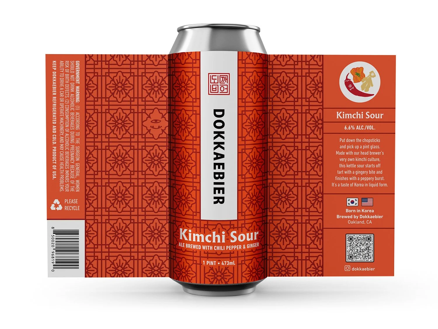
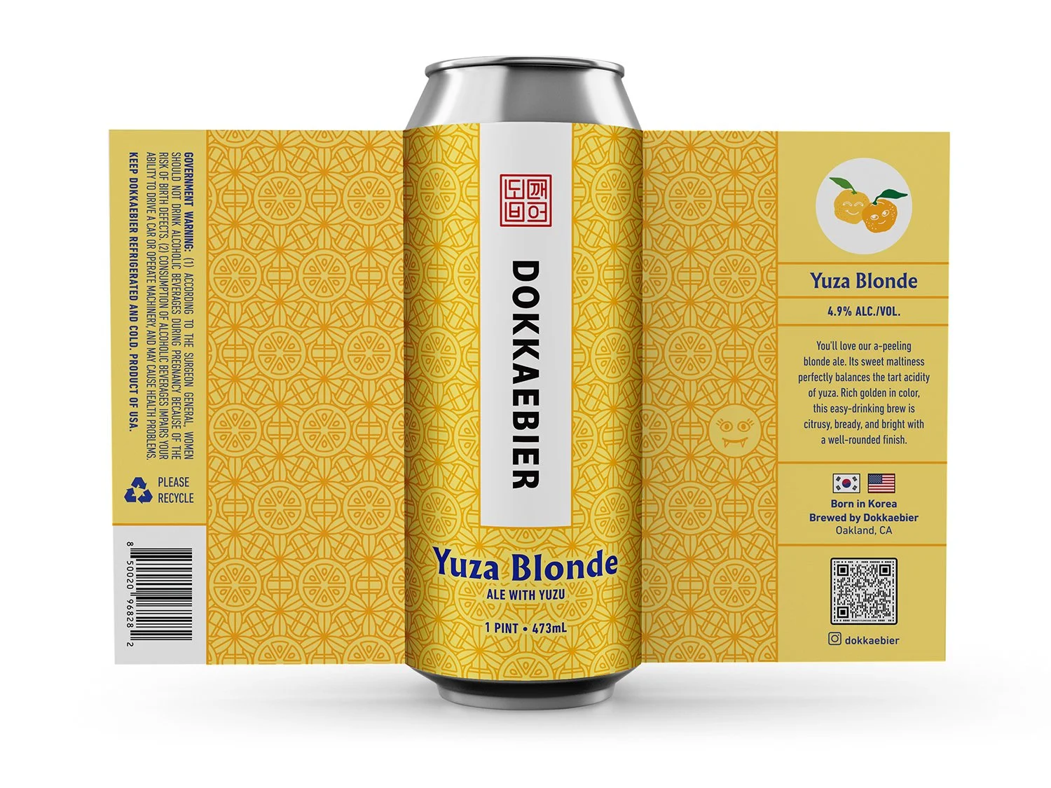
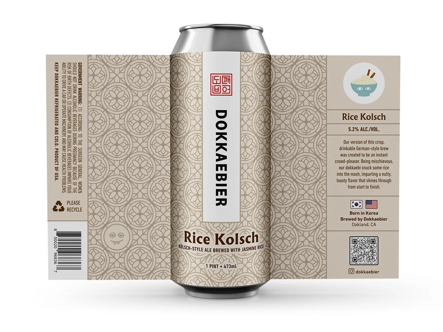
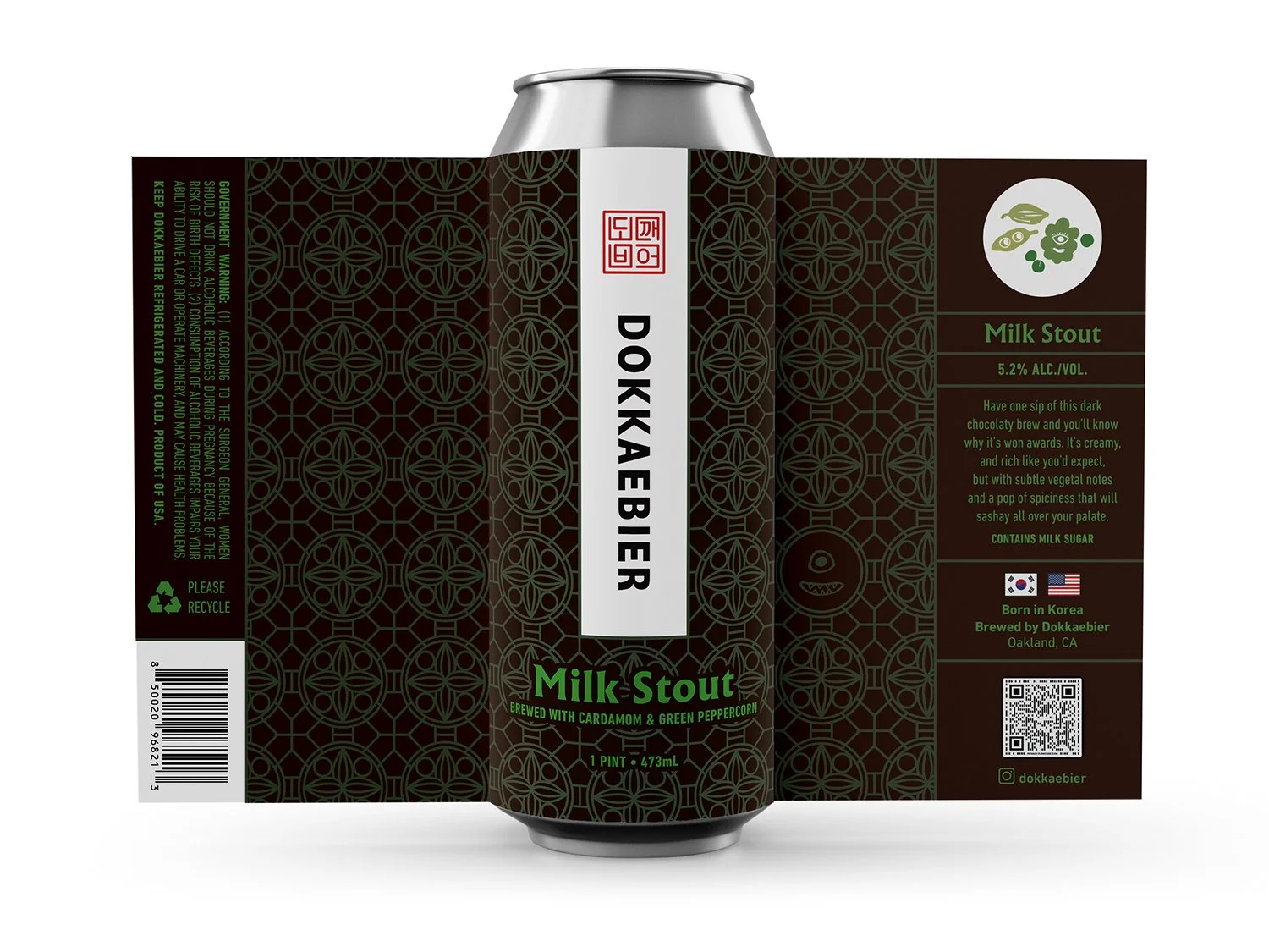
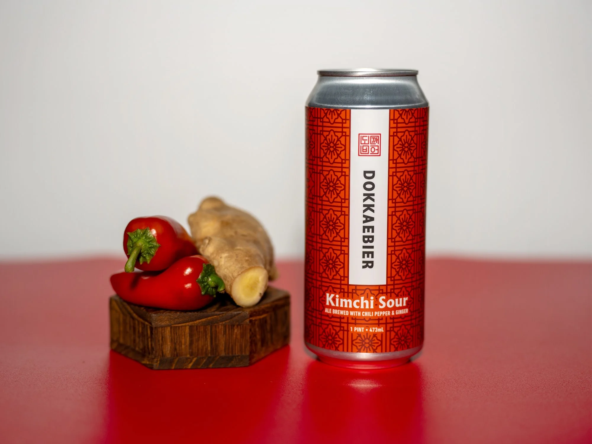
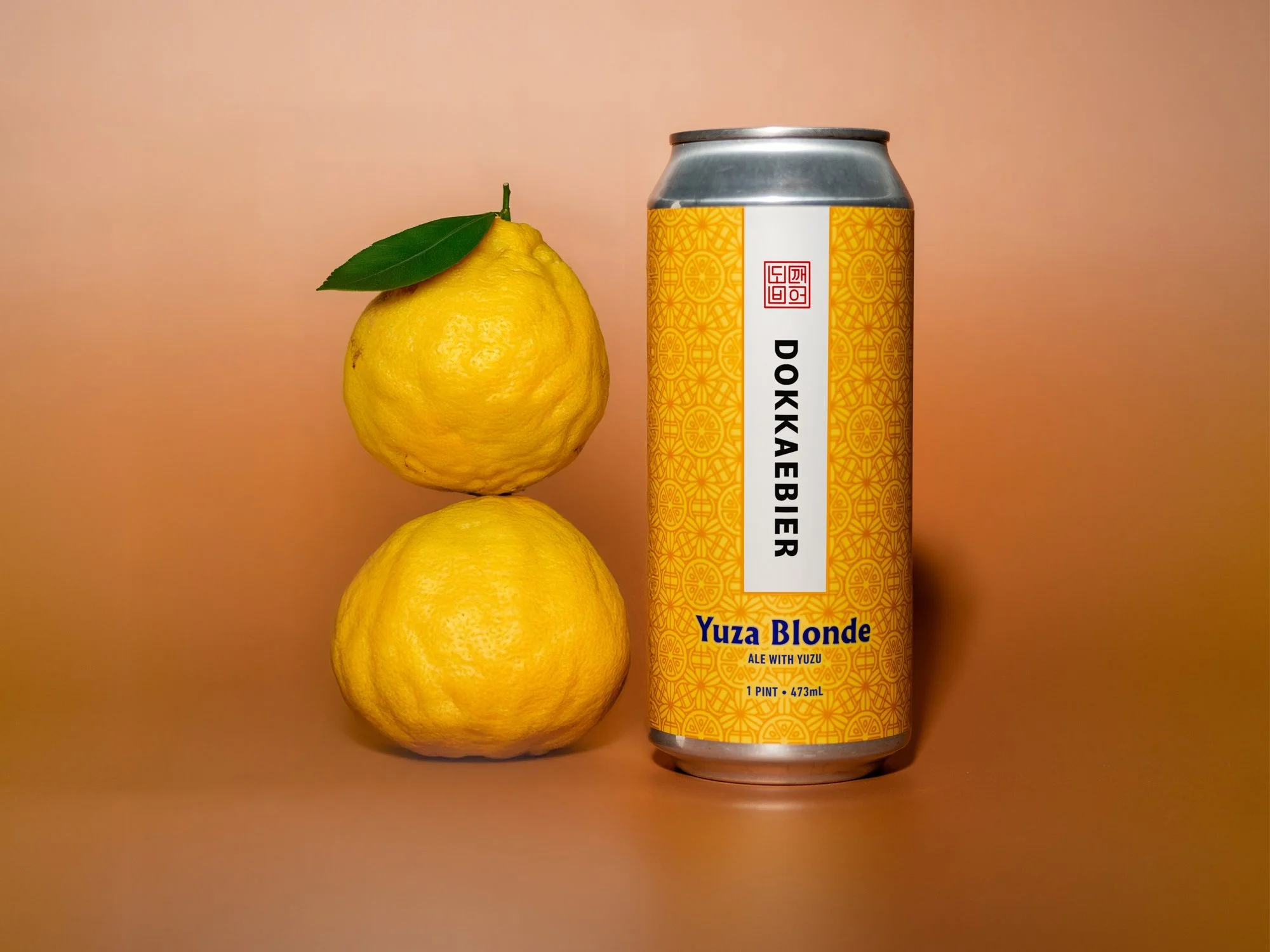
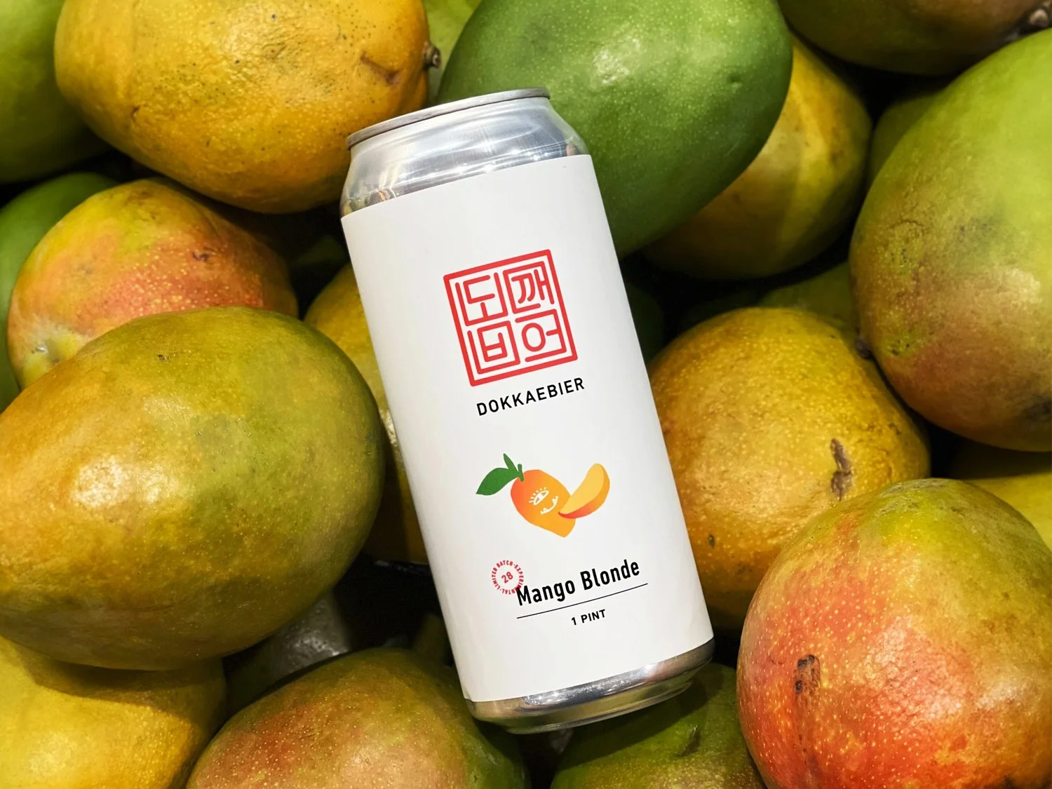
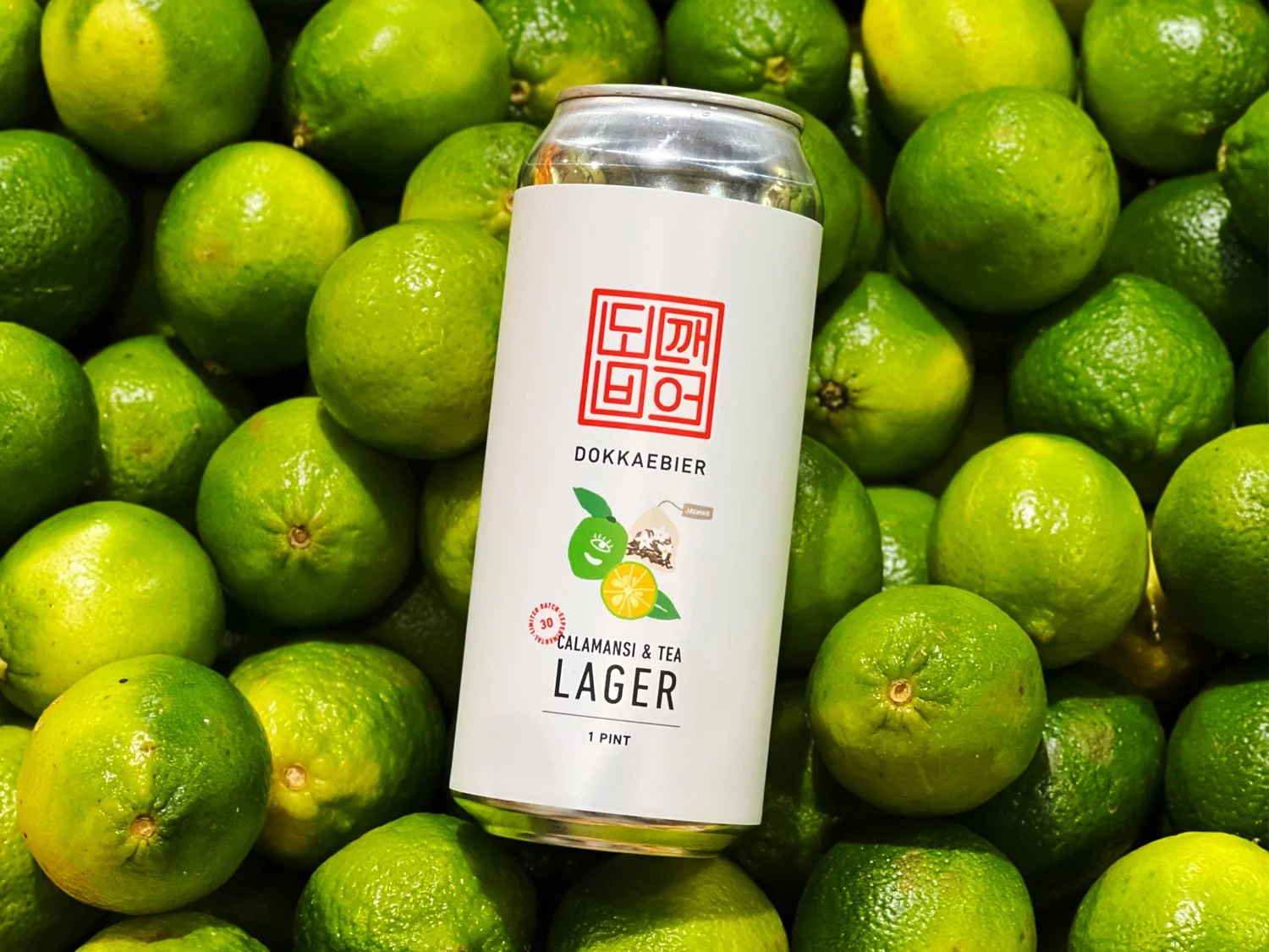
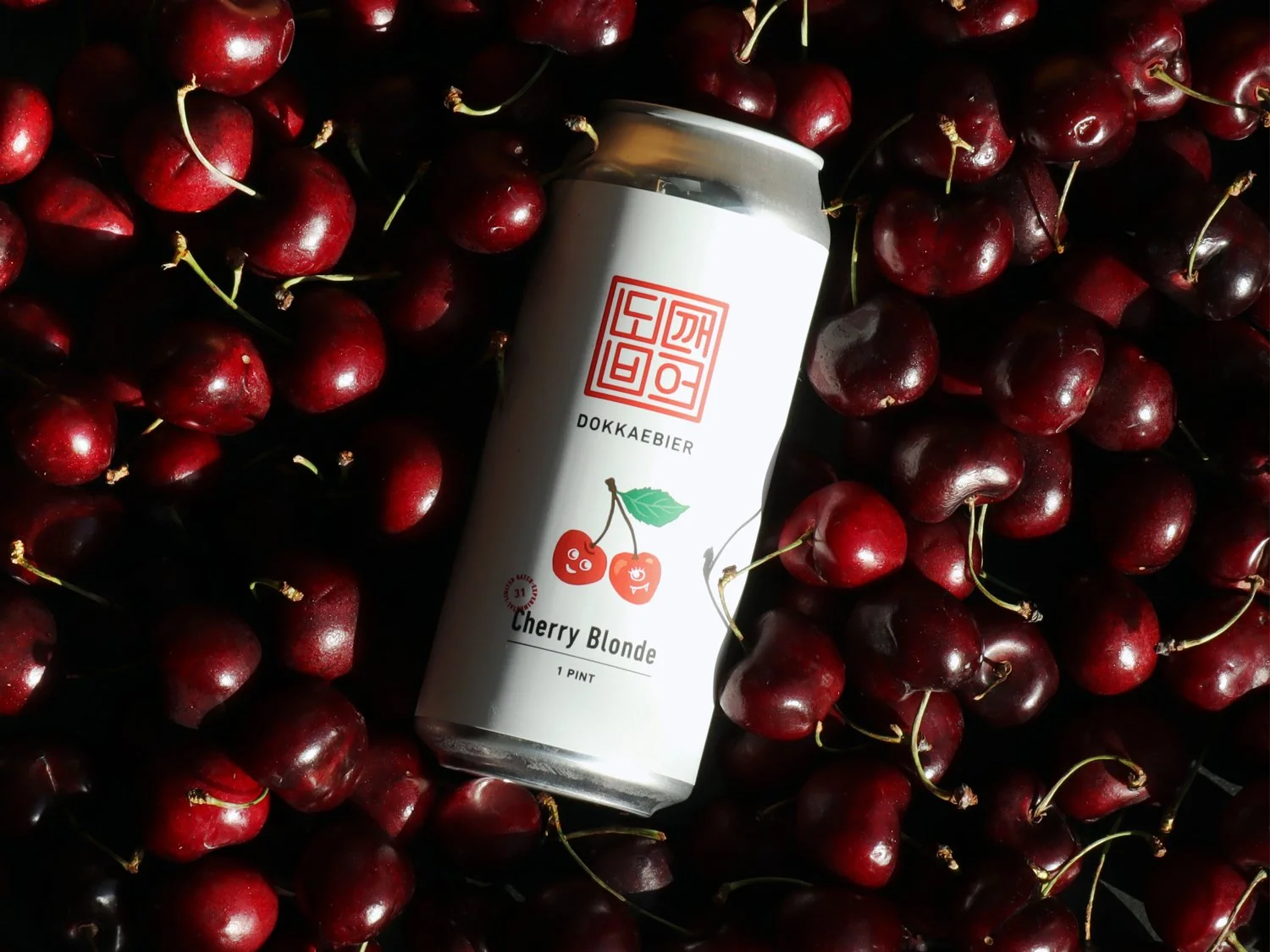
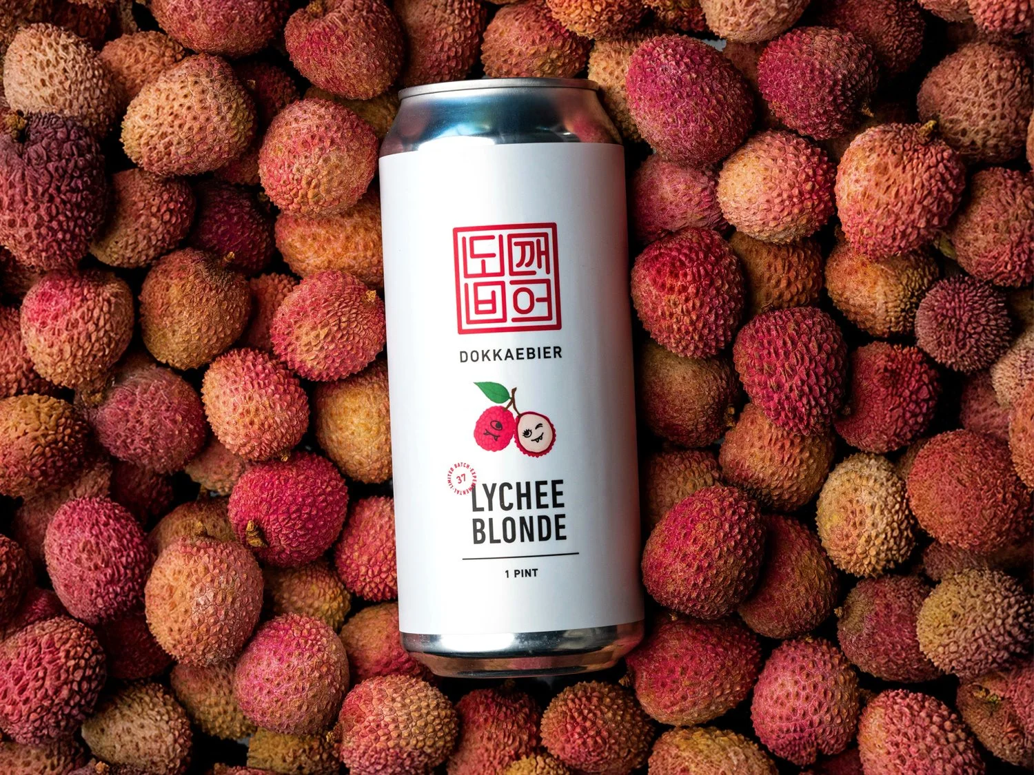
As a pioneer craft beer brand to infuse Asian ingredients, Dokkaebier’s packaging features custom illustrations, iconography, and patterns that highlight and educate consumers on unique flavor profiles.
Since its launch in 2020, the design has evolved through consumer feedback and testing, resulting in a unified system that reflects the brand’s mission and ensures visual consistency across brews.
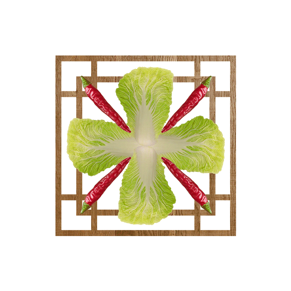
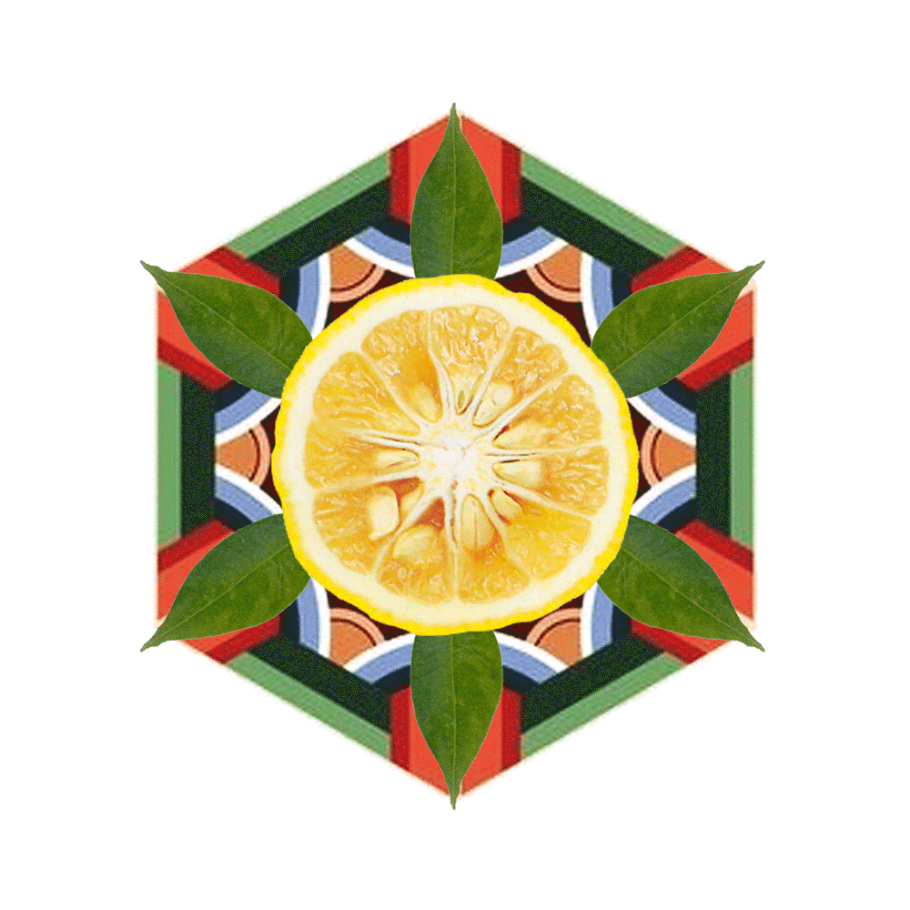
Core Brew labels feature unique patterns inspired by dancheong designs (Korean traditional painting technique) and key ingredients in each beer. A hidden dokkaebi character in each pattern adds a playful touch to the core lineup.
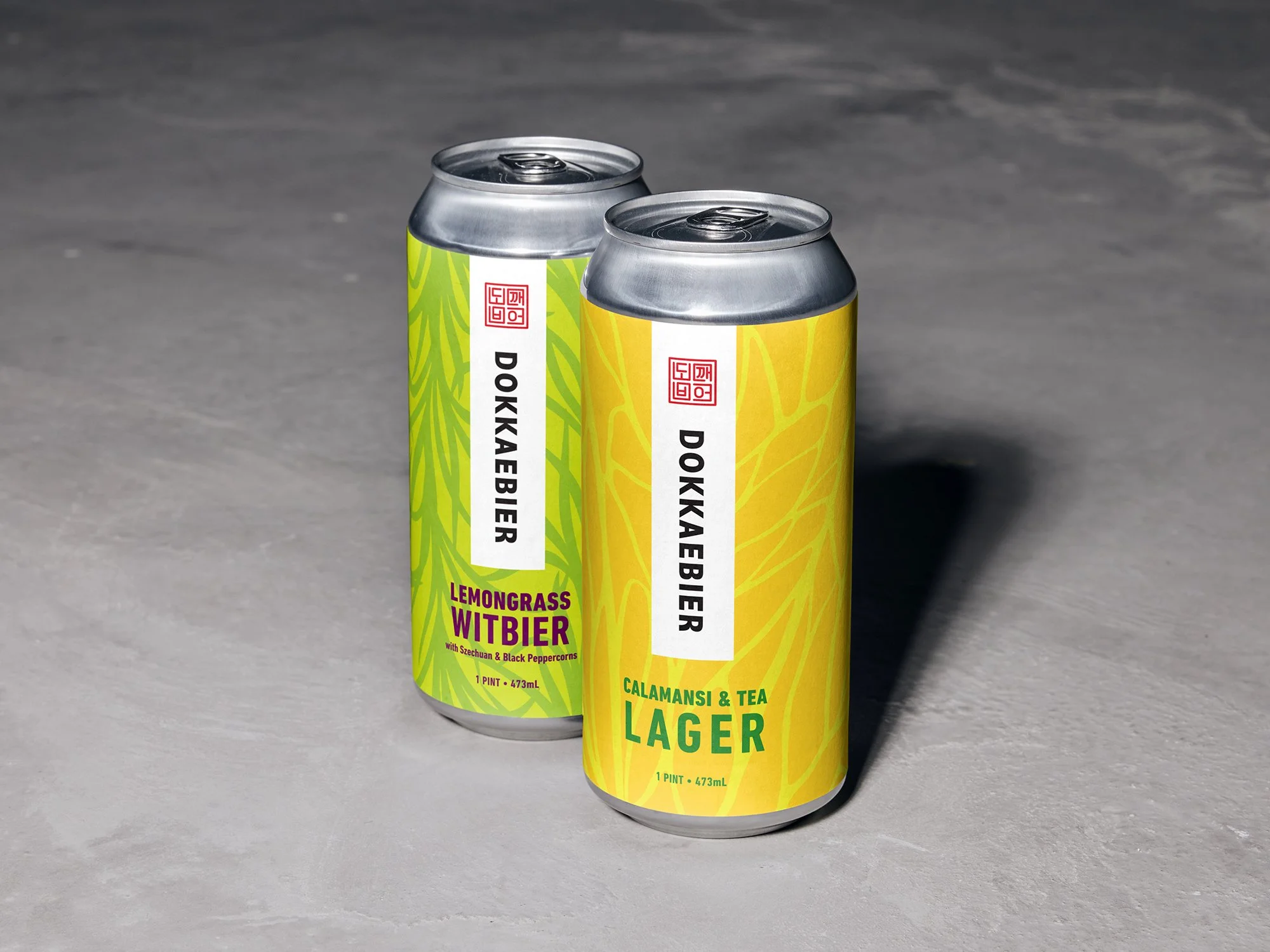
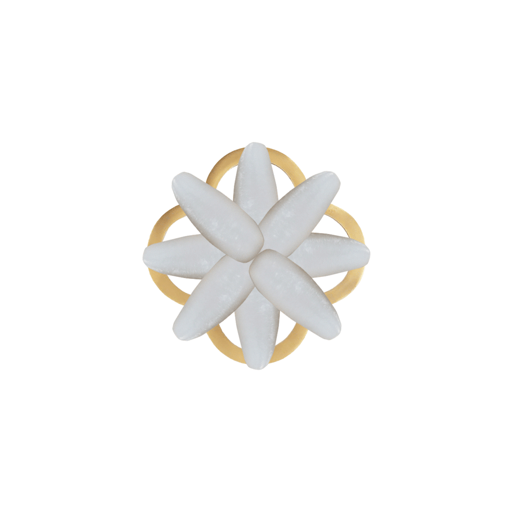

Experimental Brews feature minimal white labels synonymous with its 'carte blanche' approach to flavor.
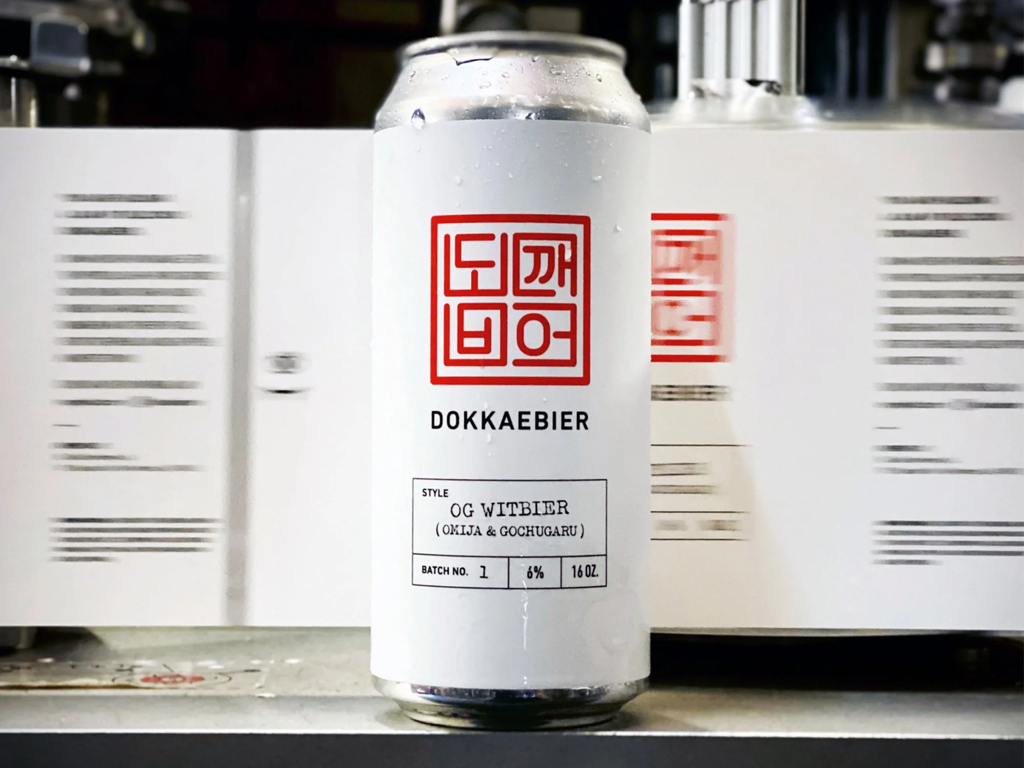
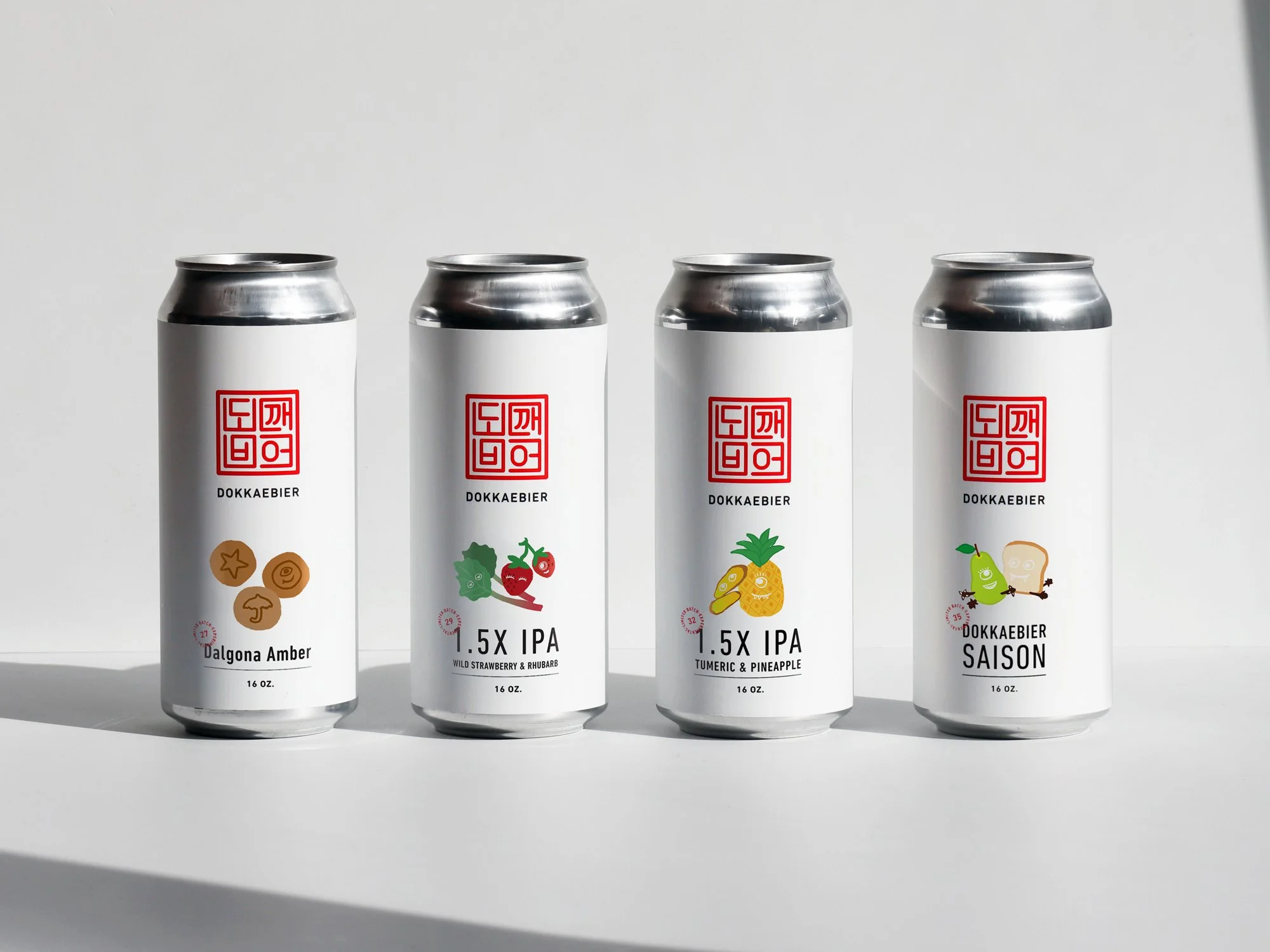
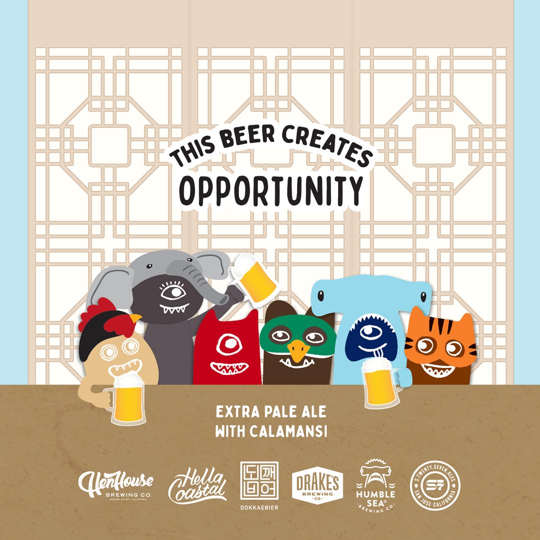
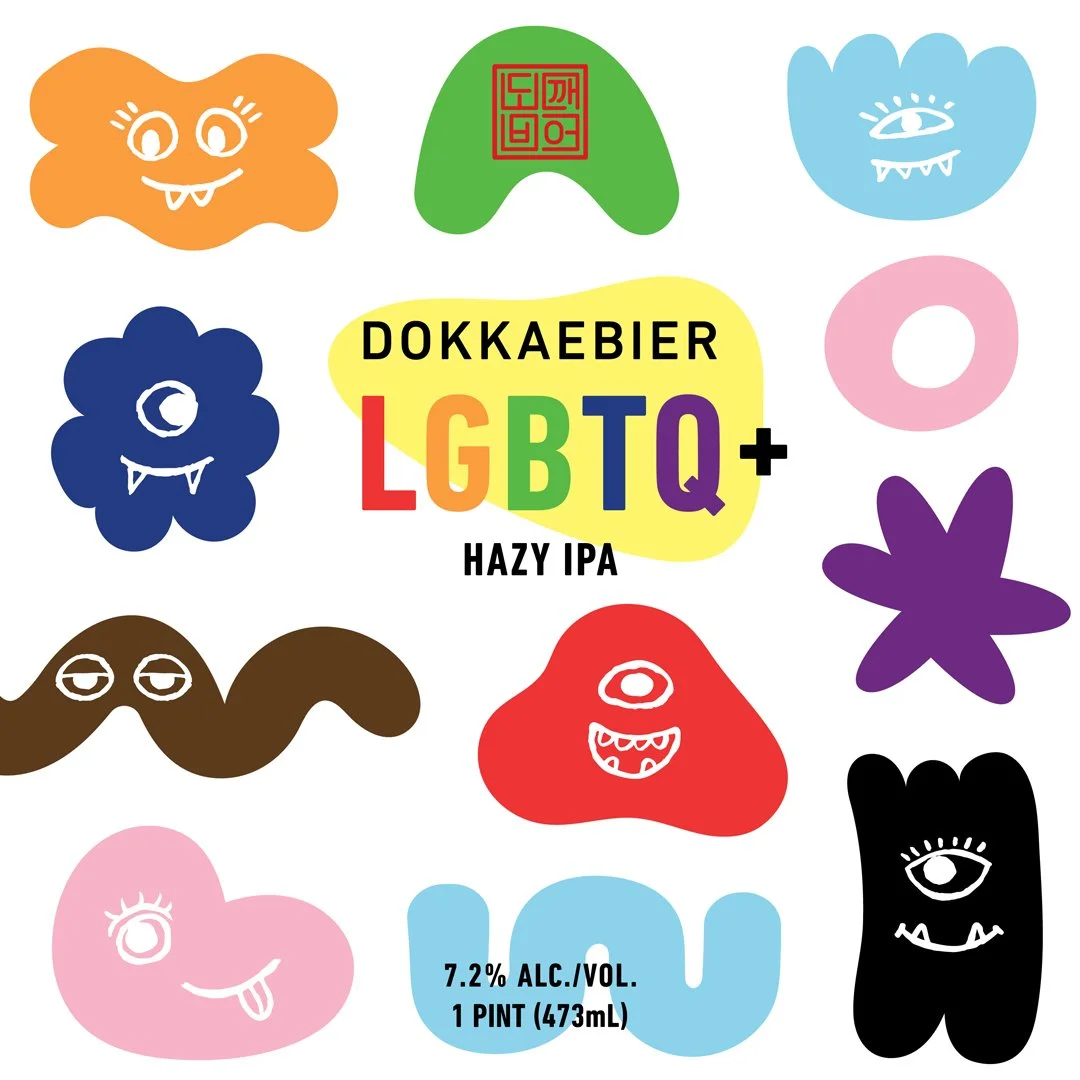
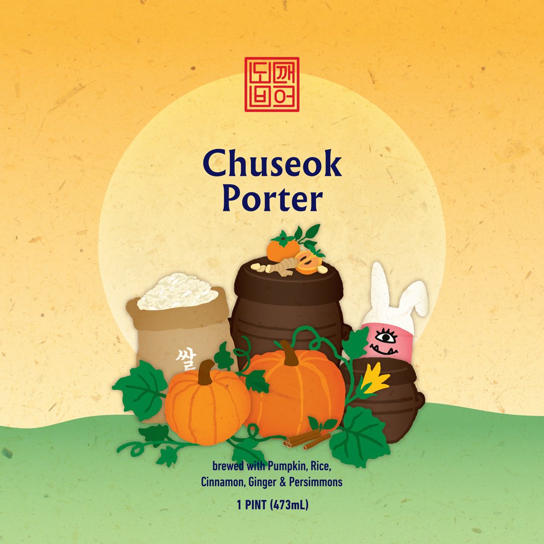
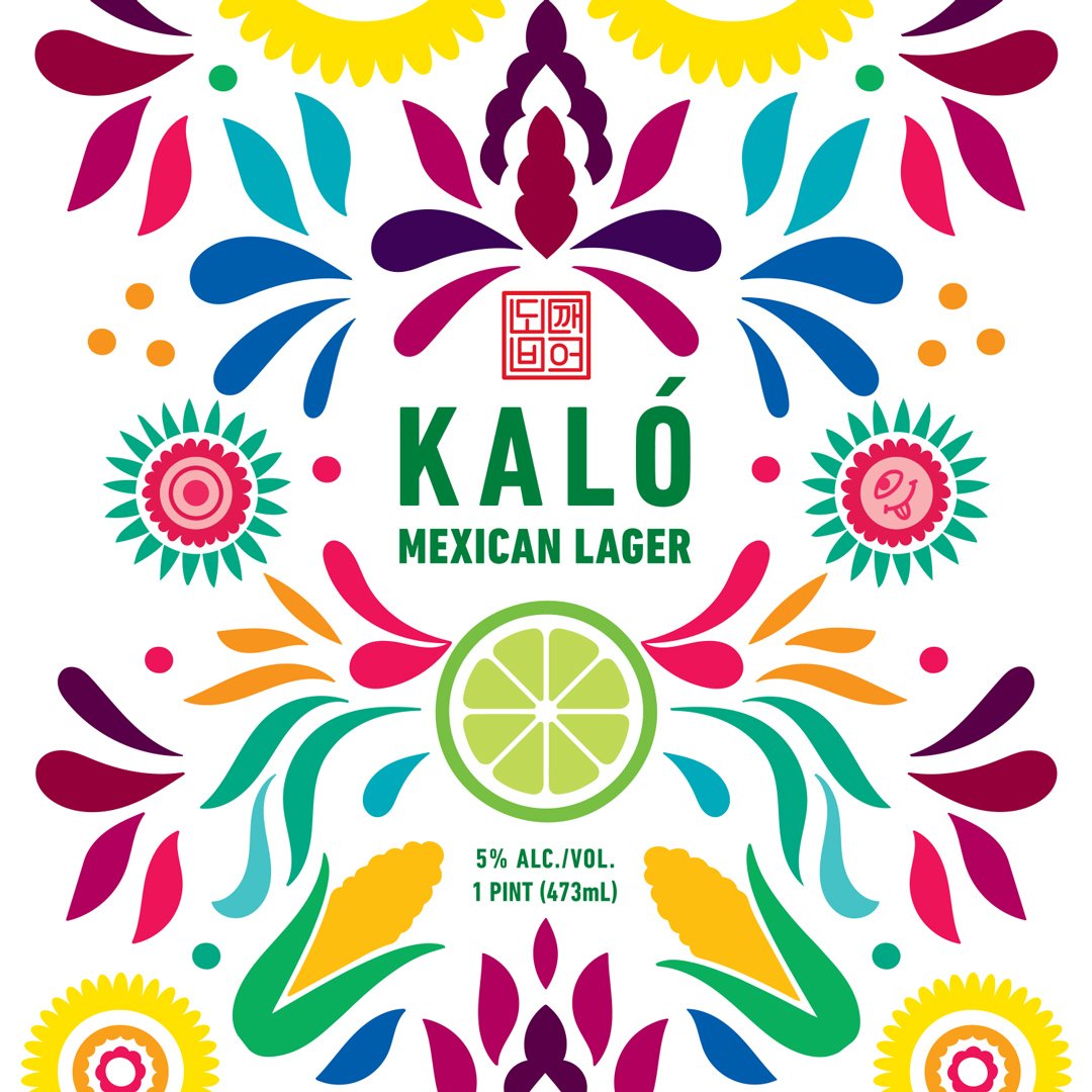
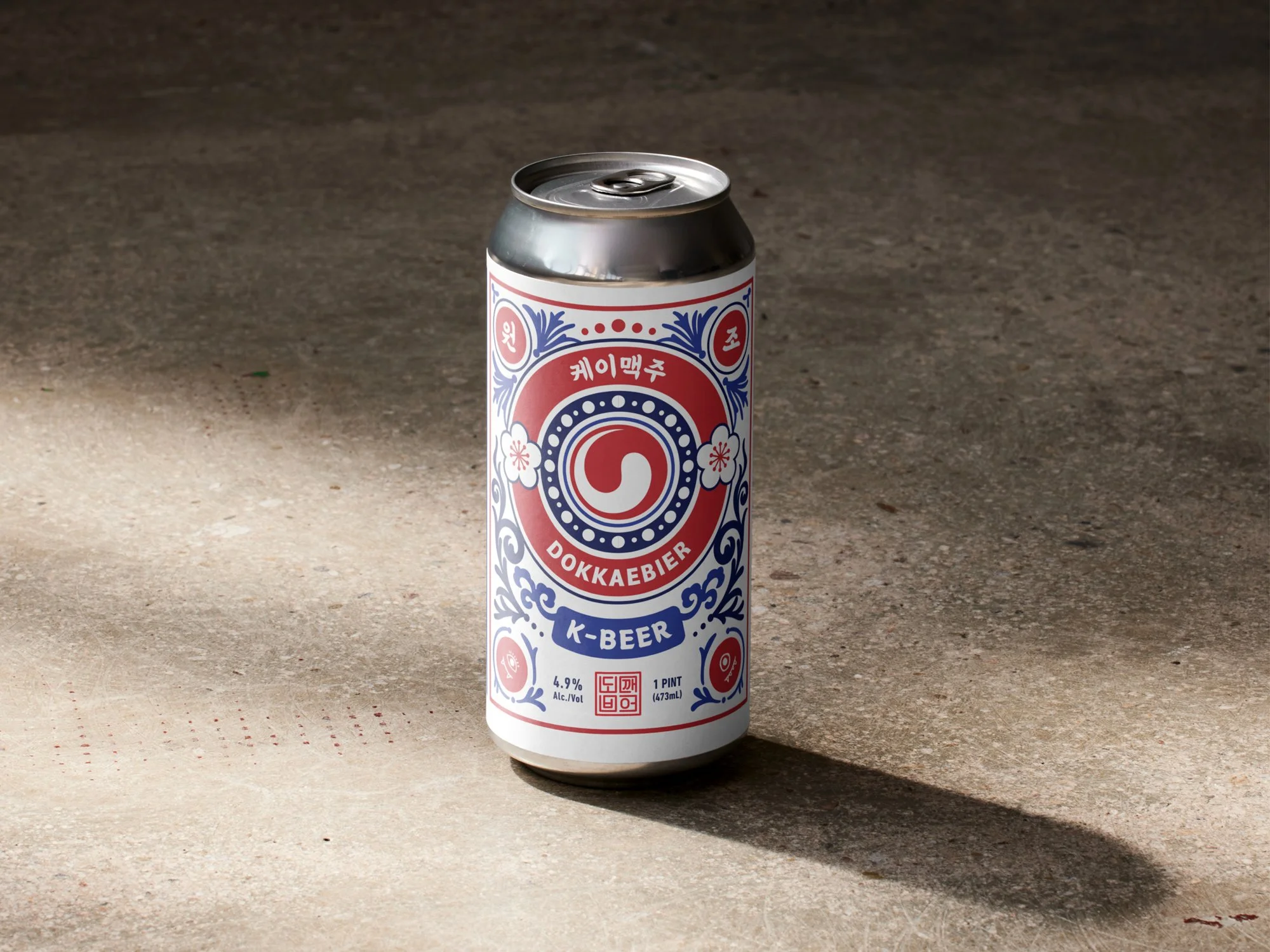
Limited edition brews showcase bespoke artwork that reflects both the cultural cause and unique flavors of the beer.